The most striking thing about the cover is the masthead, as it is a logo for the show as well as the magazine title. It is big, bold and stands out at the top of the page and is instantly recognisable.
The image of the two leading characters takes up most of the space and bleeds onto the title further emphasisng the image and the well known logo.
There is also a prize give away, key words such as 'win' 'plus' and 'exclusive' are made bolder or bigger making them stand out and drawing the readers to the tasters of whats inside.
The bold white font of used on the tagline 'Never forget' makes it stand out from the page as it differs to the colour scheme on the rest of the cover. Its positioning over the main image makes it the first thing you look at.
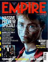
Again, the masthead jumps out the page with recognisable font and bold red colour. This time it over laps the image, increasing its importance.
The main image itself is clearly from the 'Harry Potter' movie the magazine is premoting. Its dark, sinsiter look adds a more dramatic feel and draws the reader to the cover.
The headline 'massive preview..' is big and white making it stand out against the dark background, the use of wording again very inticing.The tagline beneath the masthead, although smaller may aslo intice readers as it boasts the magazines importance calling it the 'worlds biggest' of its type.

This cover would be more similar to the type of cover i would be making as it is clearly aimed at younger readers. Its bright pastel colours again highlight a more female audience as well as the pink and feminine text on the masthead.
Simple fonts are use for the rest of the text, with white being the predominant colour. Its more cluttered than the others, with more going on and more tasters about whats inside.
The main image is fun and eye catching as the red clothing stands out against the light background with the text bleeding over the top.

 This is my final magazine cover, I decided to include my DVD on my cover to further advertise it. I have also moved some of the teasers around and added some other effects to the text including shadowing and outer glow. The free give away's such as posters feature a lot in children's magazines and also notices they use words such as 'plus!' and 'win' to draw your attention to certain aspects of the cover which I incorporated.
 Have updated the title, added a price and bar code as well as teasers etc.
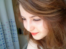
 This is an example of a cover most like what I will be aiming for as it has a similar audience to 'drama club'.