Tuesday, 23 March 2010

Ancilary progress


I have taken the photo for my front cover, and added a background and title however the title will need some editing. I plan to cut out the letters used to spell out 'drama club' at the end of my title sequence and use these as the heading. I will also add some more teasers and various 'free give aways' and try to make it as colourfull as possible. I decided to use just one charcater on the cover as magazines based on a TV series would normally feature just one character on the front as the main image for the cover with an interview ect. I may also include another smaller image of another character, perhaps someone poking out from the corner.

Thursday, 18 March 2010

Progress (final cut almost complete)

Final cut is more or less complete! (just needs finishing touches) I have edited all footage and today added the titles including 'created by' and 'drama club'. I have also added some more sound effects such as camera sounds and applause for performers and have further edited the music so it ends in time with the sequence. In terms of transitions i have added a dissolve effect to the transition between the stop frame and the footage of that particular character as well as a zoom. I have also begun work on my ancillary task and have taken my main photo for my magazine front cover, it is a working progress but so far i have cut the image and pasted it to a background and added the masthead. I have decided to have some paint splats behind the main title for the magazine and show (drama club) so i have been getting images of the Internet to cut out and play around with and maybe add to my cover. In regards to my DVD cover i am fairly confident i will have all the characters on the front of the DVD cover, with maybe some of the items associated with them. On the back will be shots from various 'episodes' along with a list of the episode names and paragraph about the show.

(will compress/export final cut and upload)

Wednesday, 10 March 2010

Update: final cut

I have now started to piece together my final cut, the footage i have taken is now uploaded and the additional shots of sehb have been completed. Feedback has shown that i need some more close ups of the characters to establish them as most shows will have a few long shots of them in various environments and then a mid/close up of them. I have taken this into account and now have some more close ups of various characters which i have added and begun to edit. The stop frama has been included withe the timmings set, i found some of the sequences. In particular andy's sequence with the camera needed to be lenghtened so i duplicated some of the photos to make it linger longer in certain positions so you can clearly see the photo come out of the camera. The music has also been added, in regards to diagetic sound i am going to include some of the speach from the shots and during andy's phototaking there will be camera clicking sounds.

Tuesday, 2 February 2010

Update: filming

Currently i have shot almost all the footage I need for my titles, all that remains is a bit more footage of Sehb wearing the drama mask etc. as i didn't have that prop at the time of the filming. I also got a few more shots of Gemma over the weekend as i wasn't completely happy with what I had, this included a shot of her practising her singing in the mirror. There have been some problems uloading my footage, i tried to upload the main bulk of my shots i took last Tuesday but there were issues so currently most of it is on a mac but i havn't added it into premier pro or begun to edit it. I also need to upload the current stop frame so i can sort out timming to the music ect. All in all the main focus is getting the footage sorted out, im confident i have more than enough with a variety of different shots in different locations, i just need to sort through what im going to use and start piecing eveything together.

Sunday, 31 January 2010

DVD cover research

This is an example of a cover most like what I will be aiming for as it has a similar audience to 'drama club'.

The font used on this DVD cover is very distinctive and childlike. It is also used during the credit's to the show meaning the title will be recognisable.

The images surrounding the main image of Tracy show her interests and add colour-they are also things that the target audience would be interested in.

The cover is overtly feminine with pink background and images of rainbows and hearts etc. the addition of the football contradicts this and suggests there may be something it it that appeals to boys too. It also shows how her character may be a tom-boy. I could consider doing something similar for my cover and have the items I used in the title sequence that linked with the characters such as microphone, camera etc. around the main image.


The title/logo of the show is placed at the top, very recognisable. This is also on the spine of the dvd and the same font in the title is used for the rest of the text on the cover.

The main image is of the main charcter (Doctor) and his companion, there is usually a medley of images as can be see here with the heroes and the villains together.

On the back is a list of the episodes on the DVD, as well as images from various episodes. A positive review is placed at the top, presumable as it is the first thing people will look at as they turn over. The white font against the purple background also draws the eye to it.

The certification is at the bottom and on the spine, as well as the institution (in this case the bbc).


Codes and conventions of mag covers

usefull website: Magforum

From looking at various magazine covers, i have picked up on some codes and conventions which i will need to consider when designing my own. The masthead is always bold, with a distinctive font that acts as a logo or symbol just as much as a title. I will need to create a logo or something similar for my TV show 'drama club' to include on the cover. The covers seem to follow the same outline, but vary in style. Children's magazines seem to be more cluttered and colourful however there is always a main image with text bleeding onto or around it. There is nearly always some kind of give away or 'exclusive' to entice readers, and the font aside from the masthead is very simple and consistent to keep it from being to confusing. A popular colour for this is white, red is also used a lot but a simple colour scheme is something i will use for my cover.

Ancillary task research: Magazine front cover


The most striking thing about the cover is the masthead, as it is a logo for the show as well as the magazine title. It is big, bold and stands out at the top of the page and is instantly recognisable.

The image of the two leading characters takes up most of the space and bleeds onto the title further emphasisng the image and the well known logo.

There is also a prize give away, key words such as 'win' 'plus' and 'exclusive' are made bolder or bigger making them stand out and drawing the readers to the tasters of whats inside.

The bold white font of used on the tagline 'Never forget' makes it stand out from the page as it differs to the colour scheme on the rest of the cover. Its positioning over the main image makes it the first thing you look at.
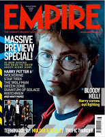


Again, the masthead jumps out the page with recognisable font and bold red colour. This time it over laps the image, increasing its importance.

The main image itself is clearly from the 'Harry Potter' movie the magazine is premoting. Its dark, sinsiter look adds a more dramatic feel and draws the reader to the cover.

The headline 'massive preview..' is big and white making it stand out against the dark background, the use of wording again very inticing.The tagline beneath the masthead, although smaller may aslo intice readers as it boasts the magazines importance calling it the 'worlds biggest' of its type.


This cover would be more similar to the type of cover i would be making as it is clearly aimed at younger readers. Its bright pastel colours again highlight a more female audience as well as the pink and feminine text on the masthead.

Simple fonts are use for the rest of the text, with white being the predominant colour. Its more cluttered than the others, with more going on and more tasters about whats inside.

The main image is fun and eye catching as the red clothing stands out against the light background with the text bleeding over the top.